
Creating great marketing emails doesn't just happen. It takes some upfront work to put together a cohesive email. This article will walk you through the initial questions to ask yourself in order to develop the concept of your email. We'll also analyze a few emails and point out some good qualities in each design, as well as what can be improved.
Determining the Purpose of Your Email
Determining the Purpose of Your Email
Taking the time to determine the purpose of your email before you begin creating it is the number one thing that separates great email design from mediocre email design. It's important to consider the perspective of your user base. This is your chance to craft a personal relationship with your users, take some time to craft your messages. Some questions to ask before designing your email are:
- What action(s) do I want the recipients to take?
- Is there a specific emotion that I want the email to invoke?
- Why should the recipients care?
- Who is receiving the campaign?
- What does success look like for this campaign?
Welcome Email Examples
Below you'll find some examples of some great welcome emails and why they work, as well as ways in which they could be improved.
Draper James
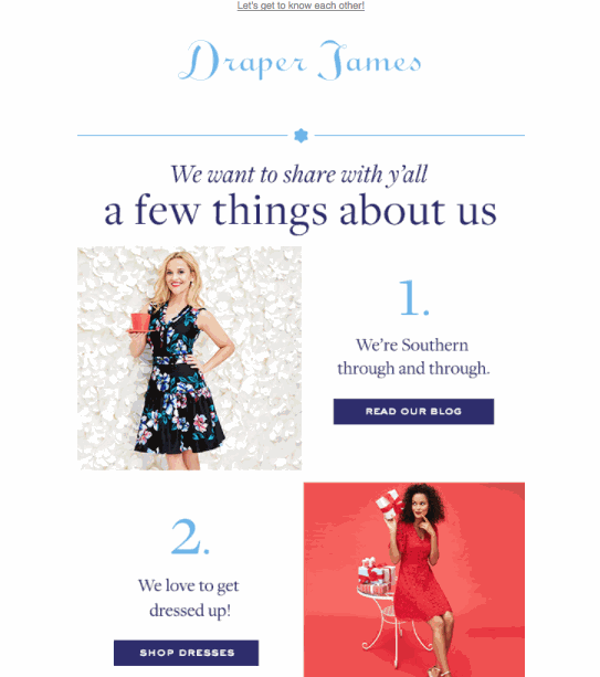
- Draper James does a great job of using the Subject Line (Let's be friends!) and Preview Text (Let's get to know each other!) to introduce what's coming in the email.
- The goal of this email is to create a friendship with their newly acquired customer. The idea here is that a new friend shares things about themselves to help build rapport.
- Each tile has a distinct feature about the business and gives a clear Call To Action (CTA).
- It's subtle, but if you notice in frames 2 and 3 the models are actually looking at the text, this subtle trick draws your eyes to the CTA and text.
- There is no menu at the top to distract you from the main content in the email.
- This may be too many items for a user to interact with, think about sticking to three distinct CTAs to decrease choice overload.
Ban.dō
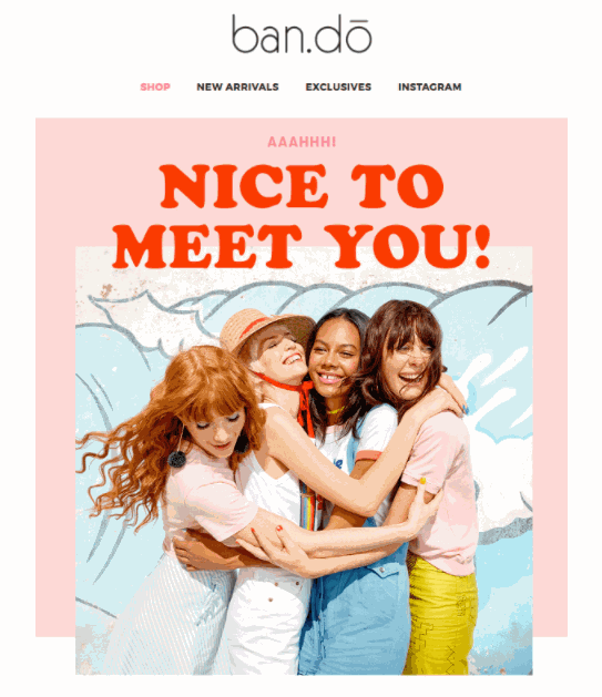
- Again we see a strategy of extending friendship. You can immediately understand what this brand is conveying. With the initial copy the user feels welcomed, warm and part of the club.
- They set the expectations of their email program, so the users know exactly what to expect.
- They offer a discount prominently in their welcome email.
- They give the user a way to further interact with a specific social channel instead of overwhelming the user with multiple choices.
- The menu bar takes away from the main message, and likely shows up in the preview text, but at least it is limited to just a few categories. This is one area where this email can improve (remember emails ≠ websites).
Sleepy Jones
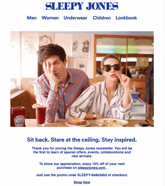
- That hero image screams personality! The juxtaposition of the tired guy and the fierce woman gives a sense of what you can expect from this brand.
- They do a good job of using the same text throughout but there are a few improvements that can be made here.
- The promo code gets lost in the paragraph.
- Make important items like this stand out so potential customers are more inclined to engage.
- Although standard links are useful for secondary items that you want to call attention to, a button format with a clear CTA would likely increase click rates.
- Below the divider they have some suggestions but no header or information to tell us what these are. Are they best sellers, personalized for me? A little description can go a long way.
- There is already a Men and Women section at the top of the email, so why repeat it? This is a space that can be used for something else, or they could move the entire menu below the message to increase mobile responsiveness and keep the focus on the primary message.
Now that we have the concept and idea of what the purpose of the email will be, it's time to begin gathering content and designing your email.
Comments
0 comments
Please sign in to leave a comment.