
When creating an email using the Template Builder, there are several ways in which you can adjust how your email will display on a mobile device. You can choose whether or not a row of content is stacked when viewed on a mobile device, whether to show content on desktop only, mobile only, or both, and you can choose how images will display on a mobile device.
Hiding Content on Mobile and Desktop
Stacking Content on Mobile
When an email is viewed on a mobile device, all of the content within your row will be stacked into a column. As the viewer scrolls through your email, each row will appear stacked.
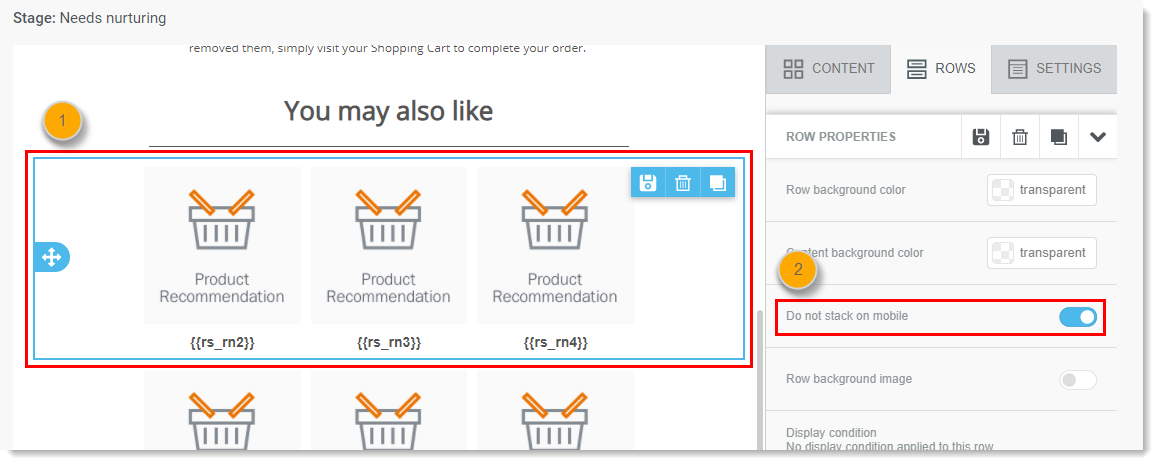
With the "do not stack on mobile" control, a row in your email can be fixed, so it displays the same on desktop and mobile.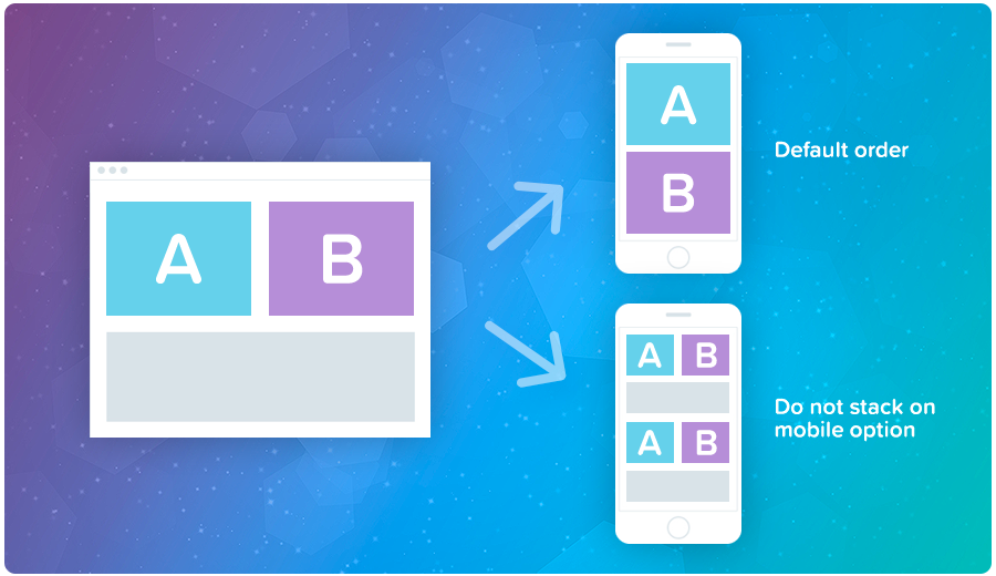
To access the "do not stack on mobile" setting:
- Hover over and click on a row within the template.
- The "do not stack on mobile" setting will appear in the "Row" properties menu on the right. Toggle it on or off depending on what your preference is.
These steps can be taken for any or all rows in your email template.
Hiding Content on Mobile and Desktop
At the row or content level, you can select images or other objects, and hide them on either mobile or desktop displays. This allows you to display content that is better suited for desktop displays only on desktop, and content that is better suited for mobile displays only on mobile.
To access this setting:
- Select the row or content block in your email template.
- The "Hide on" setting will appear in the "Row" properties menu on the right. Select the hide control for either desktop or mobile.
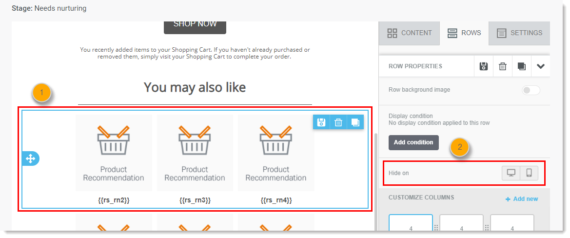
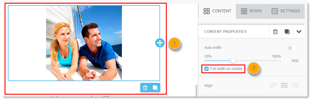
Image Width on Mobile
When manually setting the width of an image in an email, you can set the image to display full width when viewed on a mobile device, even if the image isn't set to full width for desktop.
To access this setting:
- Click on an image in your email.
- The width setting will appear in the "Content" properties menu on the right. Checkmark the "Full width on mobile" box.
Note: The "Auto width" setting must be switched off in order to access this feature.
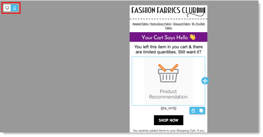
Mobile vs Desktop Email View
In order to preview what your email will look like when viewed on a mobile device versus a desktop, use the icon in the top left of the template builder.
Comments
0 comments
Please sign in to leave a comment.